Farm Journal: Logo Design
And now for something completely different.
I’ve never considered myself to be artistic. It’s very hard for me to make my hands produce what my brain is envisioning… i.e., I can’t draw. Granted, I’ve never actually tried to learn, but…
Well, this mindset had me procrastinating terribly on designing a logo for the farm business. Michael and I had some ideas, and a stylistic vision inspired by my sister Ellen’s linoleum block prints. Of course, Ellen—as always—is absolutely slammed with projects, volunteer work, a new job, and helping take care of our mom during her cancer treatment in Seattle, so while she wanted to help, it just wasn’t going to happen. So, I finally decided to give it a stab myself.
But how was I going to do art without, you know, doing art?
Technology to the rescue!
Now, also granted, I am absolutely no tech wizard. Luckily, I found a mobile app called Adobe Express (basically, Photoshop for Dummies) that was easy enough for even me to use. It has templates to make Instagram posts, brochures, collages, business cards, and yes, logos, and more. You can also freewheel it and make whatever visual product you want, up to 20 inches square. I discovered that you can upload photographs and, by manipulating the color, contrast, sharpness, and so forth, and using the “remove background” feature, you can turn a photograph into something that almost looks like a line drawing. Download it as a transparent image, then you can plug it into your designs and create something genuinely original.
I felt like a genius.
Here are some examples of photos and how I ‘shopped them into ~*Art*~:
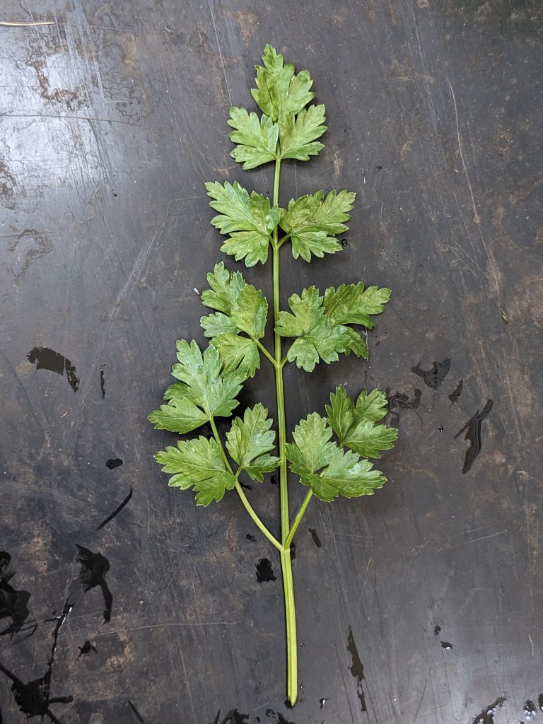
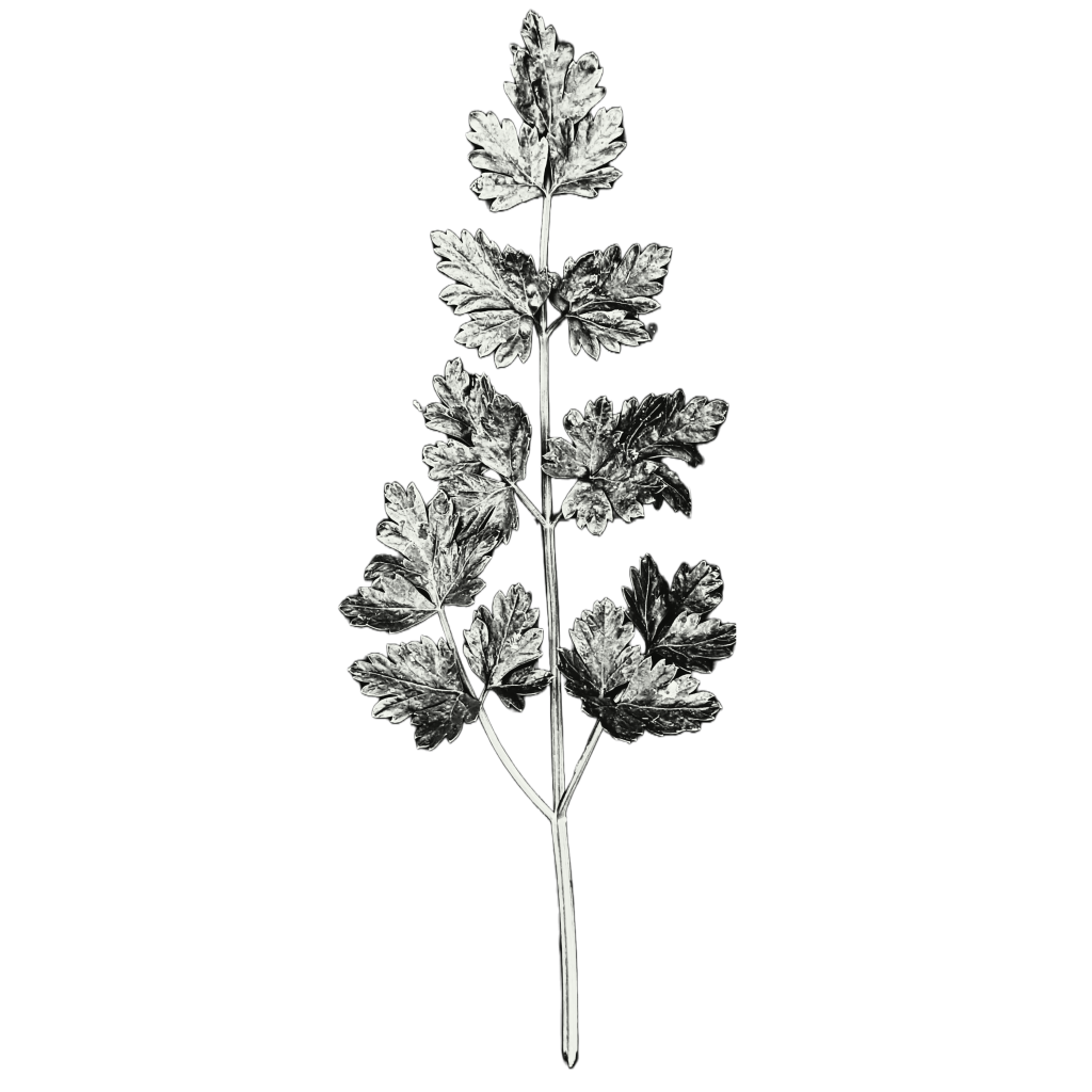
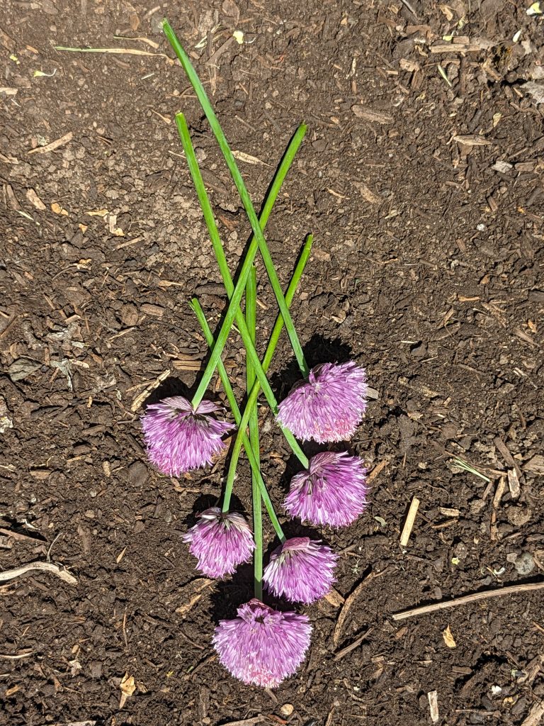
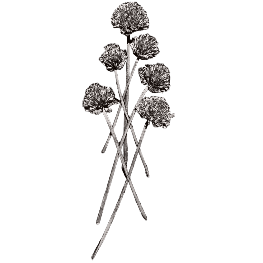
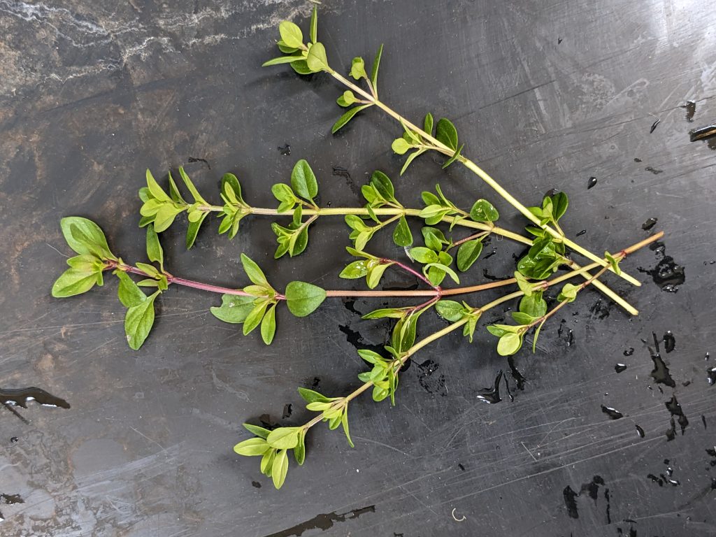
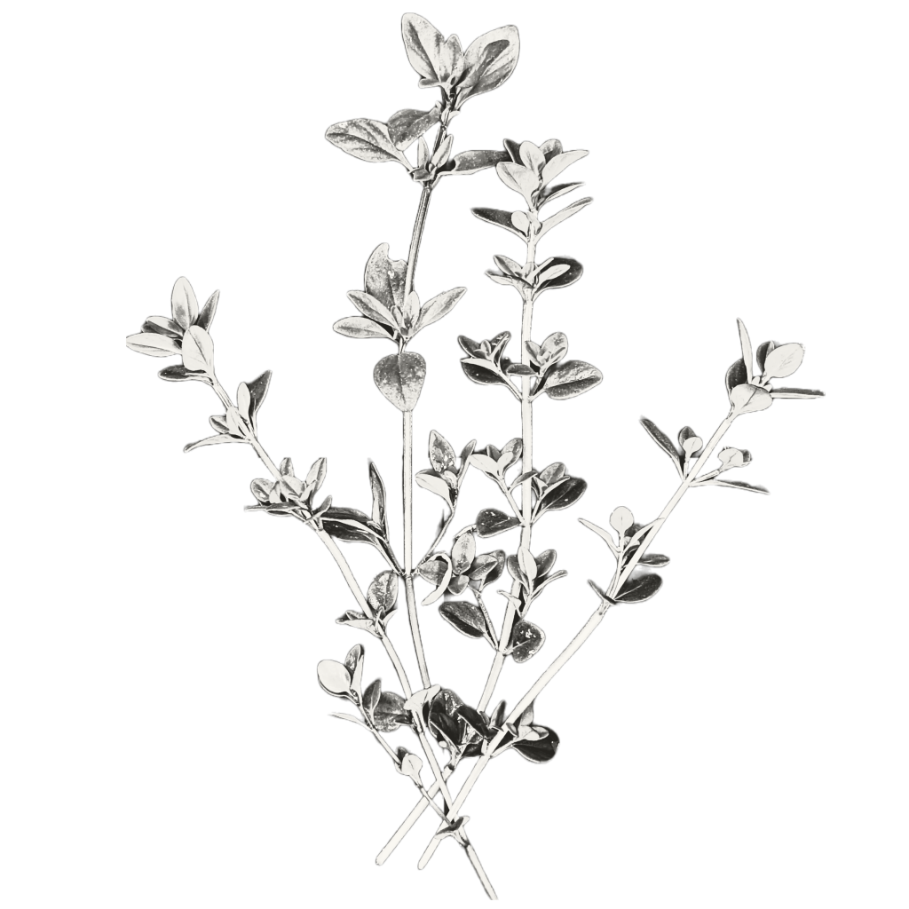
It was almost too easy to throw together pretty official-looking designs. And with the color palette shuffle feature, it was way, way too easy to make endless color variants of each design. I tried out a few different styles, ranging from bright and fun to cool and sophisticated. I peppered the family group chat with my creations, and it soon became apparent that everyone favored the cool and sophisticated look. For example:
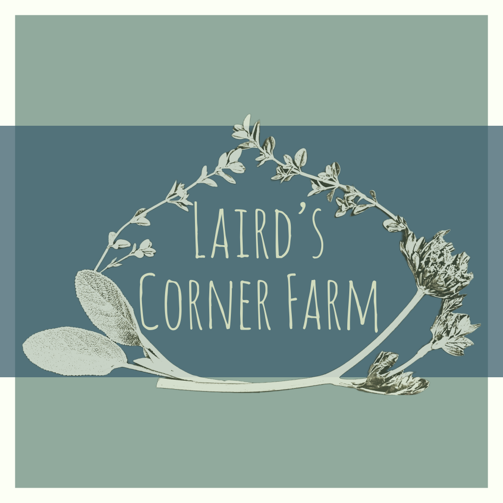
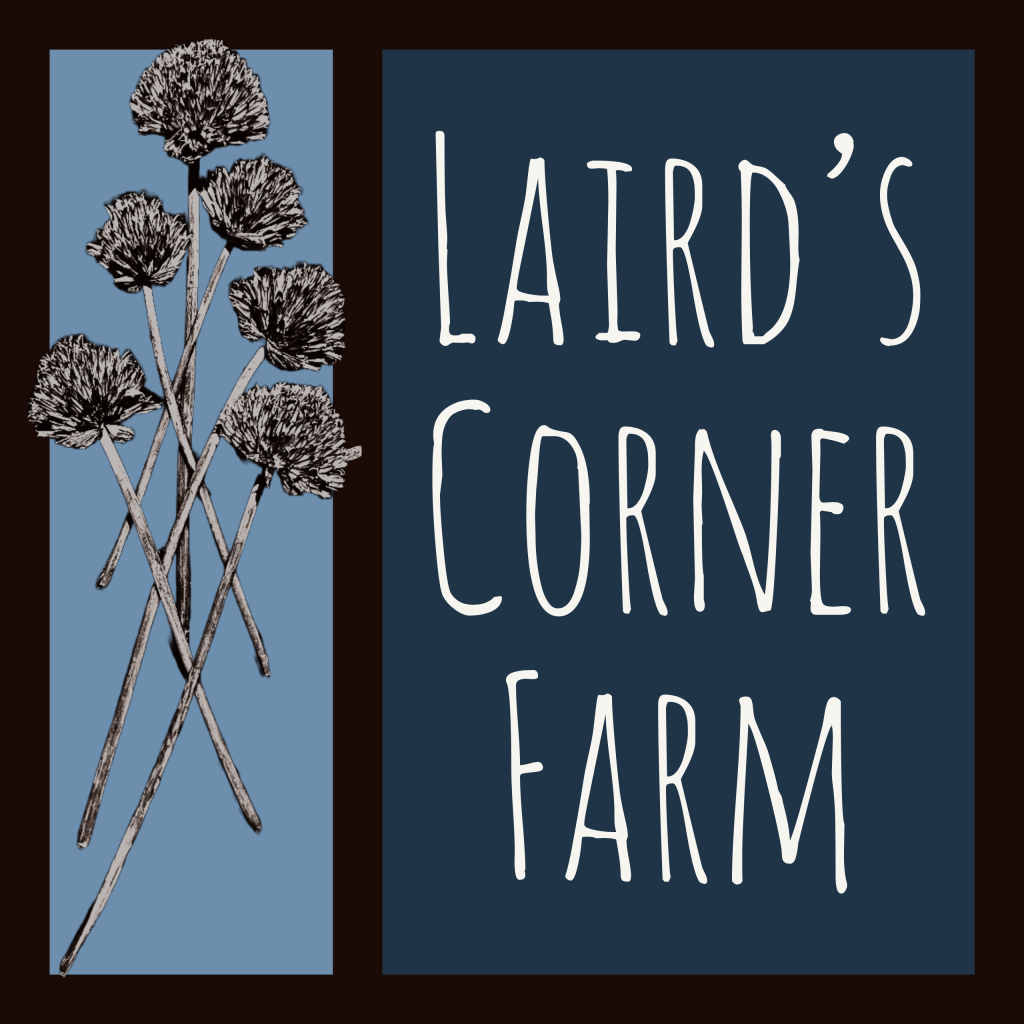
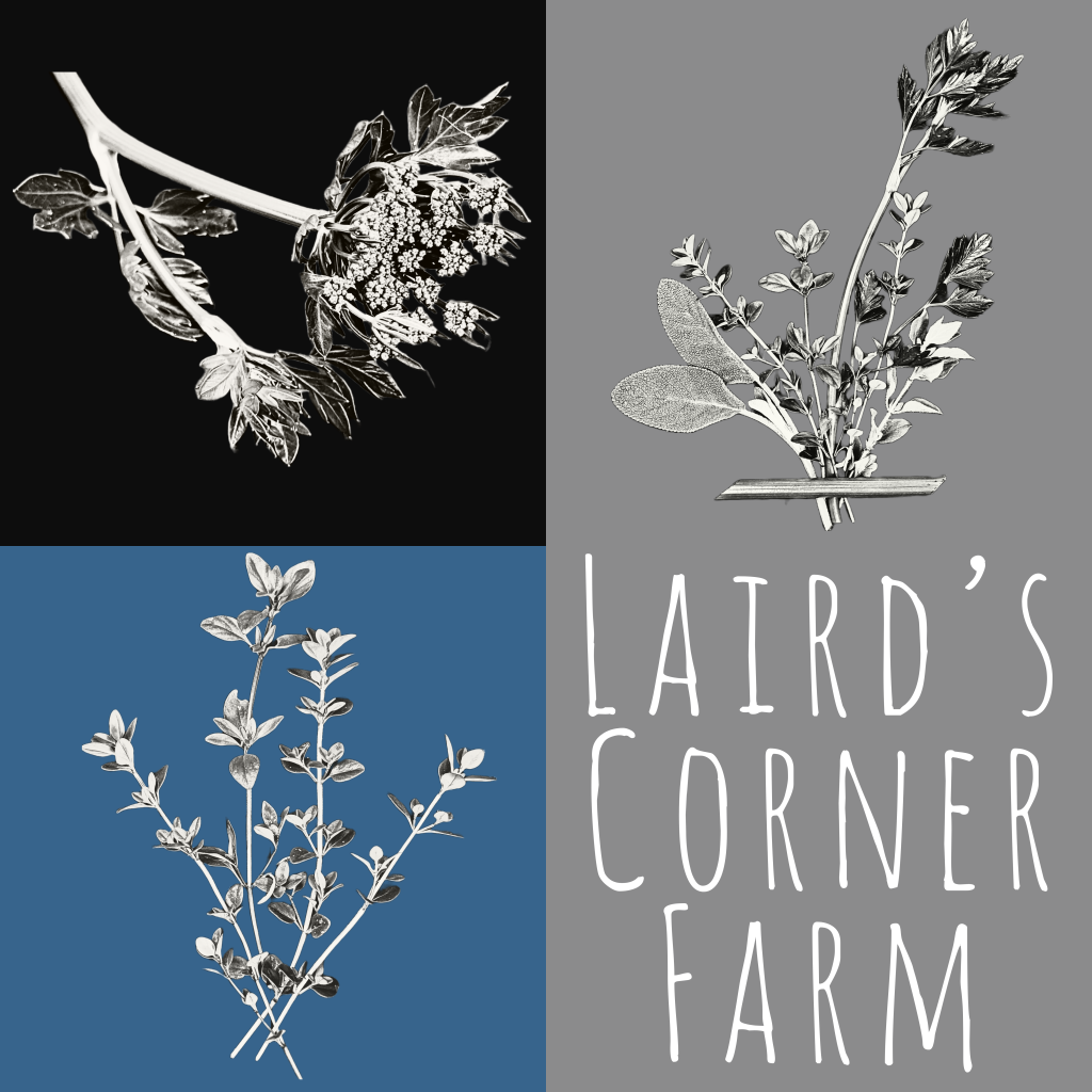
(The favorite font was also clear from the outset.)
Personally, I also like the colorful designs I made. Maybe for team t-shirts, someday?
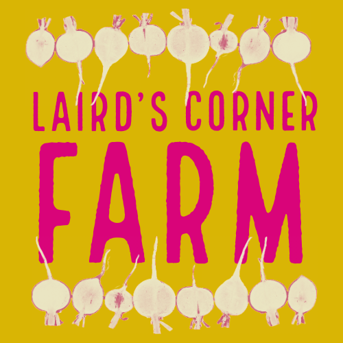
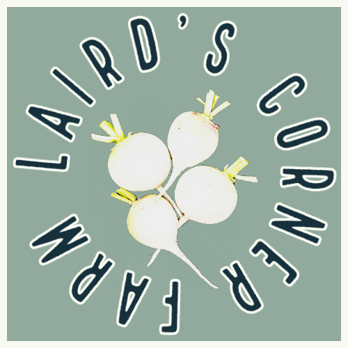
The Port Angeles Farmers Market team is publishing vendor profiles on their website this month and I didn’t want to leave our profile with a blank where the logo should be. I picked one that 1) had gotten good feedback from the family, 2) I had remembered to set the image size as large as possible for best resolution, and 3) had bold enough images and text to see when displayed at a small size.
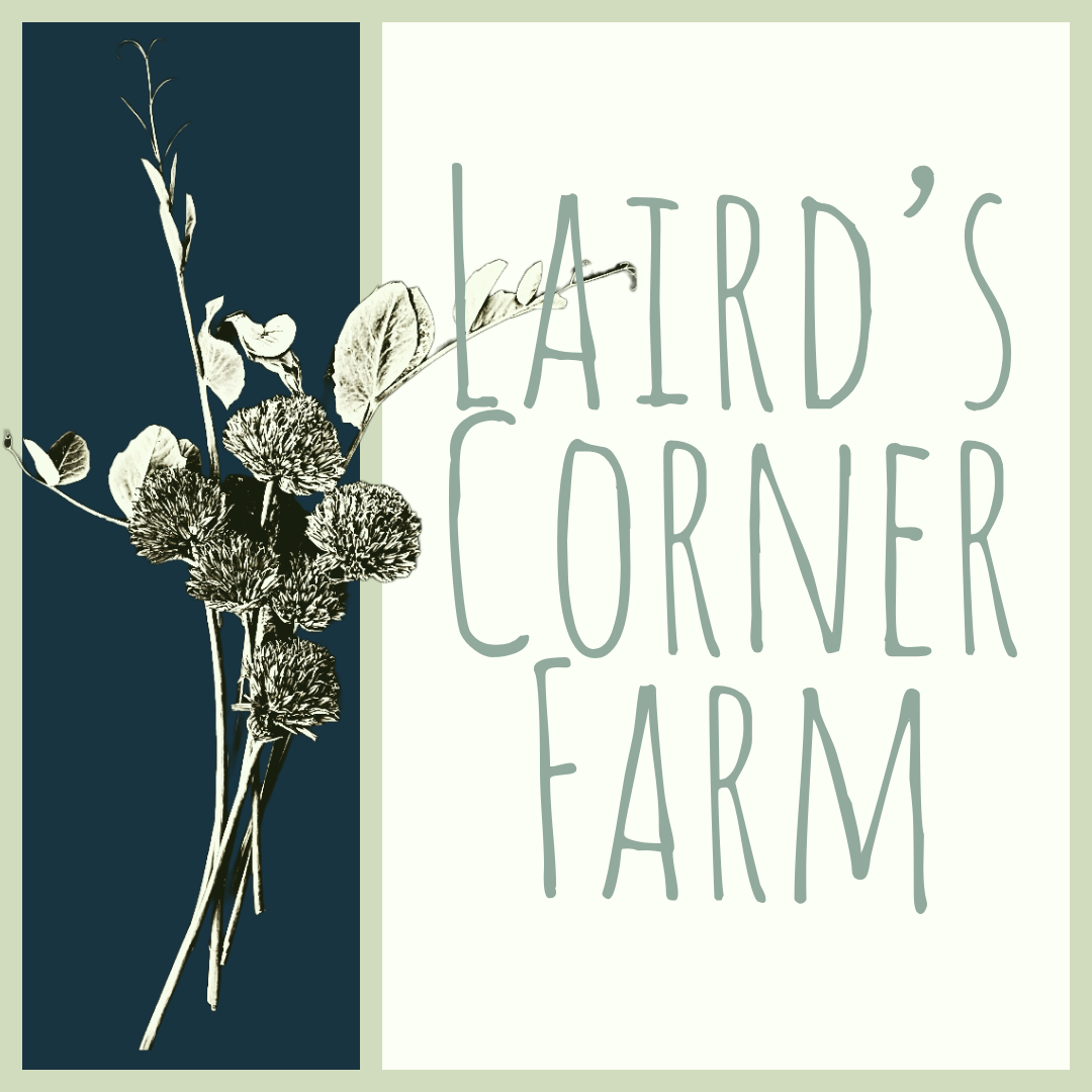
So…! Here it is, the official Laird’s Corner Farm logo (for now):

Next up, I’ll be designing business cards, posters, signage, and… what else? Trucker hats? Stickers? Custom acrylic nails??? (Nah, just kidding.) (Unless…?)